This article is older than 2 years. Some information might be outdated.
What is Sweet Alert?#
If you're tired of classic alert windows, you can use the SweetAlert library, a modern and mobile-compatible alternative. If you're curious about how to use it with PHP, you can check out the PHP Morris Js article.
First of all, you need to include the library in your project.
Including SweetAlert Library#
<script src="dist/sweetalert.min.js"></script>
<link rel="stylesheet" type="text/css" href="dist/sweetalert.css" />
Let's make the alert window open when a button is clicked:
<button id="alertButton">Click Me</button>
Now let's add the jQuery codes:
Sample Code#
<script type="text/javascript">
  $(function() {
    $("#alertButton").click(function () {
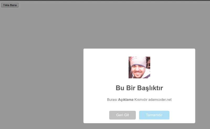
      sweetAlert({
        title: "This is a Title",
        text: "This is the <b>Description</b> part adamcoder.net",
        allowEscapeKey: true, // If you set it to false, the ESC key won't close it
        customClass: "custom-class", // Like <button class="custom-class">
        allowOutsideClick: false, // If you set it to true, it closes when you click outside
        showCancelButton: false, // Cancel button is invisible
        showConfirmButton: true, // Confirm button is visible
        confirmButtonText: "Okay", // Customize the button text
        confirmButtonColor: "#AEDEF4", // Change the confirm button color
        cancelButtonText: "Go Back", // Cancel button text
        closeOnConfirm: true, // Window closes when confirm is pressed
        closeOnCancel: true, // Window closes when cancel is pressed
        imageUrl: "/images/sweetalert.webp", // Image of the alert window
        imageSize: "100x100", // Image size
        timer: 10000, // Closes automatically after 10 seconds
        html: true
      });
    });
  });
</script>
SweetAlert Arguments#
| Argument | Description |
|---|---|
| title | The title part of the alert. |
| text | The description text in the alert window. |
| type | Determines types like "warning", "error", "success", "info". |
| allowEscapeKey | Allows closing the window with the ESC key. |
| customClass | Allows you to add a custom CSS class. |
| allowOutsideClick | Determines if the window closes when clicked outside. |
| showCancelButton | Shows the cancel button. |
| showConfirmButton | Shows the confirm button. |
| confirmButtonText | Determines the confirm button text. |
| confirmButtonColor | Changes the color of the confirm button. |
| cancelButtonText | Changes the cancel button text. |
| imageUrl | Adds a custom image to the alert window. |
| imageSize | Determines the width and height values of the image. |
| timer | Automatically closes the window after the specified time. |
| html | Allows you to use HTML tags. |
| animation | Changes the opening animation. |
| inputType | Determines input field types like "text", "password", "submit". |
| inputPlaceholder | Adds a hint text to the input field. |
| inputValue | Adds a default value to the input field. |
| closeOnConfirm | Makes the window close when the confirm button is pressed. |
| closeOnCancel | Makes the window close when the cancel button is pressed. |
Sample Image#
Comments